- 3 Minutes Wednesdays
- Posts
- 3MW (11 Learnings From 11 Charts)
3MW (11 Learnings From 11 Charts)
Albert Rapp
December 20, 2023
Guten Tag!
Many greetings from Munich, Germany. Great news 🥳 Today, my data visualization course launched. It is designed to teach Students the most important dataviz principles and how to apply them in ggplot to create informative charts.
So to celebrate the release of my course, I’m going to share 11 learnings from 11 charts that we create in the video course. Let’s dive in.
Color-highlights + curved labels = ❤️
When it comes to line charts, it is important to avoid spaghetti plots, i.e. charts that contain waaay too many lines that go all over the place. Here, it helps to
reduce lines by grouping,
use colors to highlight the important colors,
and put labels directly on top of (or below) the lines.
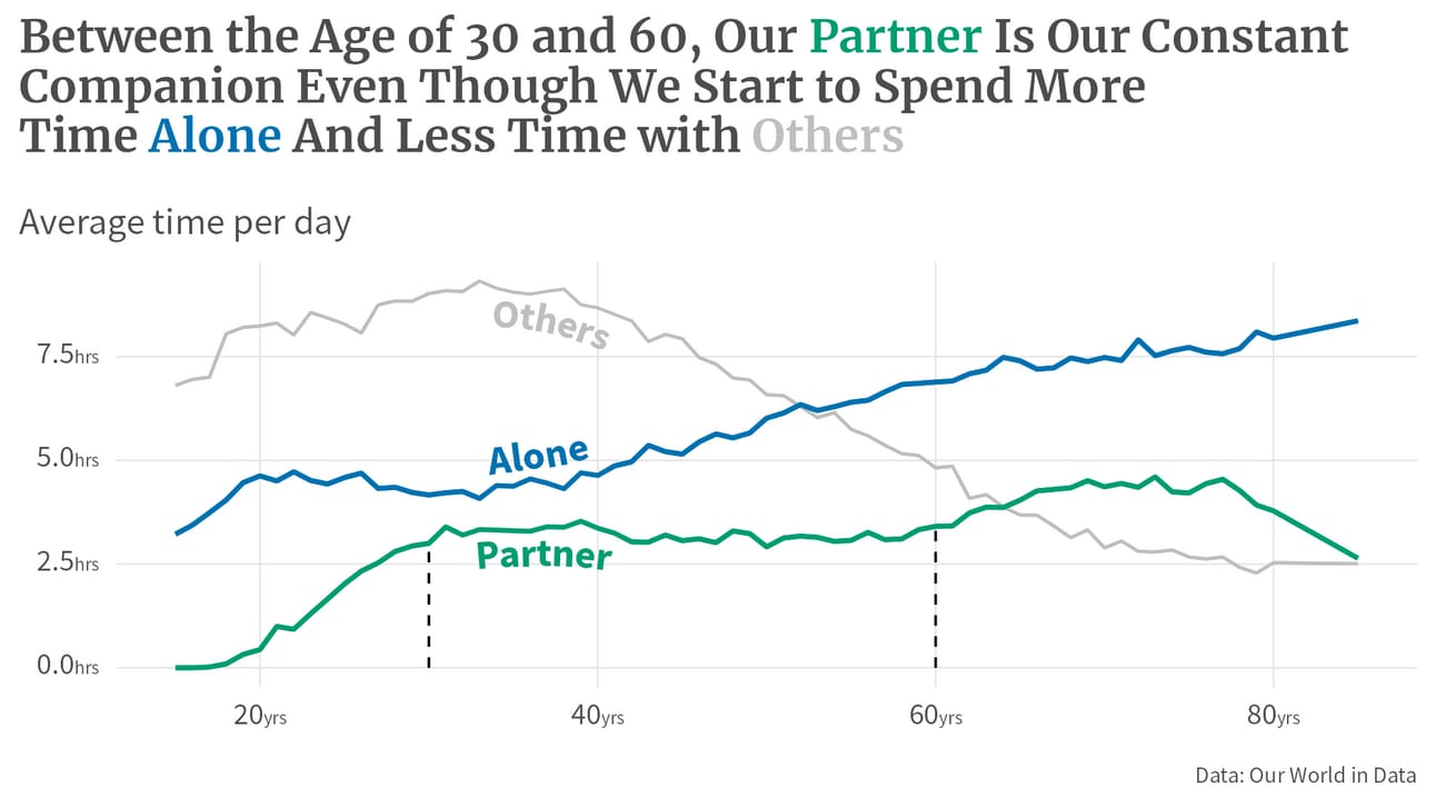
In ggplot, two packages are an invaluable team to do just that: {geomtextpath} and {gghighlight}. The former makes it possible to place labels on a curved line so that it looks like the labels are part of the line and the latter makes it dead-simple to grey-out unimportant parts of your chart.
Dumbbell plots are great for making comparisons but beware of the order
I am convinced that dumbbell plots are the best tool to compare two values among many groups. Muuuuch better than a paired bar chart.

But you have to be careful that you group your dumbbells (see how Zimbabwe is place a bit differently in the above chart because the 1952 value is larger than the 2007 value which is in contrast with the other countries in the chart).
When dumbbells hit their limit, go for slopes
Even dumbbells have their limits. In the above chart, it would be really hard to add many more countries to the picture (unless you want to make the image huge). Instead, when you want to focus on the change, try out a slope chart instead. With color highlights, you can easily focus on the group you want to focus on anyway.

Heat maps are great for patterns
Got lots of groups and want to highlight a specific pattern? You should think about doing a heatmap. I’ve demonstrated that in my latest YouTube video. But for a more elaborate chart that shows that, check out the heat map that we create in the course.

Enhance bar charts by highlighting differences
Bar charts are used A LOT. Often they’re used to show how big some number is. And often they want to focus on how much bigger this number is. But people rarely stop to make bar charts more informative by simply making this information very explicit.

Bar charts are easily turned into lollipops
I have been saying that bar charts are incredibly boring for some time now. As an alternative I always like to propose lollipop charts. In ggplot, it’s really easy. Just replace geom_col() with geom_segment() and geom_point() and you’re done.
If you want to be fancy and have country-related data, you might even fill the points of the lollipops with flags. The {ggflags} package makes that really easy.

Waffle chart = {ggpattern} + {patchwork}
Waffle charts are a great way to highlight the magnitude of some numbers using icons. I’ve long been thinking about what the best way to create them with {ggplot} is. Turns out, it’s really easy. Do two things:
Focus on one group first (you can assemble multiple charts later on with {patchwork})
And for the waffle of one group, think of it like a heat map. You first draw tiles with
geom_tile()and then you replace that withgeom_tile_pattern()from {ggpattern} to fill the tiles with an image “pattern”.

{ggforce} makes the best annotations

See the rectangle with the pointer and the label in the chart? That’s mostly the work from geom_mark_rect() from {ggforce}. The only thing I changed was to replace the text of the annotation with geom_richtext() from {ggtext} (to make the color highlights).
But other than that, the rectangle and the pointer-line-thingy was completely drawn by {ggforce}. This package is really a random collection of insanely powerful functions.
Shameless plug
If you want to learn how to create insightful charts like this, then sign up for the course today. You can find all the information about the course, on the course page.
Bubble charts = As easy as scatter plots

If you can create scatter plots, then creating bubble charts is just as easy. Just map the size aesthetic to some variable too. But by default, the bubbles look a little bit ugly. So that’s why I like to
use filled points (
shape = 21) with afillcolor and white outline (usingcolor)Increase the sizes of the bubbles with
scale_size_area(max_size = …)
{ggdist} makes the best violin plots
Violin plots are a nice way to visualize the distribution of some quantity. geom_violin() can easily do that. No need for an extra package. But the cool thing about the plots from the {ggdist} package is, that you can use half-violins and plot them side-by-side 😍

The way to make that work is to use stat_halfeye() and mape the side aesthetic to some categorical variable (like city names) and then use scale_side_mirrored(). Et voilà, side-by-side half-violins.
Raincloud plots are still a fancy way of showing distributions
The headline says it all. Raincloud plots are cool. But what’s also really cool is that with {ggdist} (which I use for creating raincloud plots), you can draw your reader’s attention to the extremes of a distribution.

The trick here is to use the computed level variable from stat_halfeye() and to map the fill or color aesthetic to this variable using after_stat().
These were all the learnings I have in store for you today. If you want to learn more about the techniques I have used here to create beautiful visualizations, check out the new video course. As always, if you want to reach out to me, just reply to this mail or find me on LinkedIn.
Also, we’re on break next week. I wish you happy holidays and I’ll see you in the next year 🍾
See you,
Albert 👋
If you like my content, you may also enjoy these:
Reply