- 3 Minutes Wednesdays
- Posts
- 3MW (Aligning elements in Shiny apps - Part 1)
3MW (Aligning elements in Shiny apps - Part 1)
Albert Rapp
May 03, 2023
Guten Tag!
Many greetings from Ulm, Germany.
Let’s start with great news: I am super excited to share that my talk to posit::conf(2023) was accepted 🥳 🎉
I'll talk about “HTML & CSS for R Users”. And I have more good news: posit::conf(2023) is starting only in September but if you don’t want to wait that long, I will give a similar talk for the R User Group at the Harvard Data Science Initiative. It's already happening on May 18. You can sign up and join us for free online. Also, check out the cool poster, they’ve made for my talk.

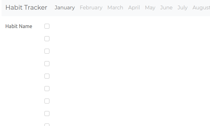
Moving on to the actual content of this week’s newsletter. Let us talk about aligning things with HTML and CSS. This is quite tricky but can become very important for, say, ensuring that your Shiny app looks nice. That’s why I’m going to show you how to build the UI for this Shiny habit tracker.
Spoiler: We won’t be able to complete this app today. So, Part 2 will wrap things up next week. As always, the full code can be found on GitHub.
Start with a NavbarPage()
First, we need a navbarPage() with a tabPanel() for each month. We will fill the January panel and the other panels remain empty. That’s why I create the January panel manually and the rest with map() and R’s month.name vector. The latter vector contains, you guessed it, the names of every month.

Throughout our newsletter, we will leave the server function empty and only change the UI. In any case, here’s how our app currently looks. Nothing much to see yet.

Create a scrollable div container
Next, create a div container with fixed width that is horizontally scrollable. To do that, you need to set the overflow-x CSS property to scroll.

Notice that single elements will be kept together but everything else is wrapped according to the width. That's why 'Long content' is on one line and the 'hereeee...' on another. With the scrollbar I can now navigate to the end of 'hereee...'.

Create first habit
Now we can create our first habit by replacing our 'long content' with a div that contains
another div for a habit name and
yet another div for the checkboxes
And in order for the two inner divs to appear next to each other (instead of below each other), the surrounding div needs to be a flexbox.


Add checkboxes
Combining checkboxInput() with map(), we can add a checkbox for each day in January.

Rearrange the checkboxes
Oh my, this didn't work quite as expected. That’s because each checkbox from checkboxInput() will be surrounded by a div container by default. And if the surrounding div container that contains all of these checkboxes is not a flexbox, then the divs will be placed below each other. So let's fix that.
While we're at it, let's add a little bit of padding at the top and bottom of each checkbox container so that there is equal space above and below each checkbox. Also, let us add a background color so that we can see if everything is truly centered.


Unfortunately, a couple of things happened:
The box for the habit name got small
The checkboxes are small and not centered at all
Let’s fix that one step at a time.
Fix habit width
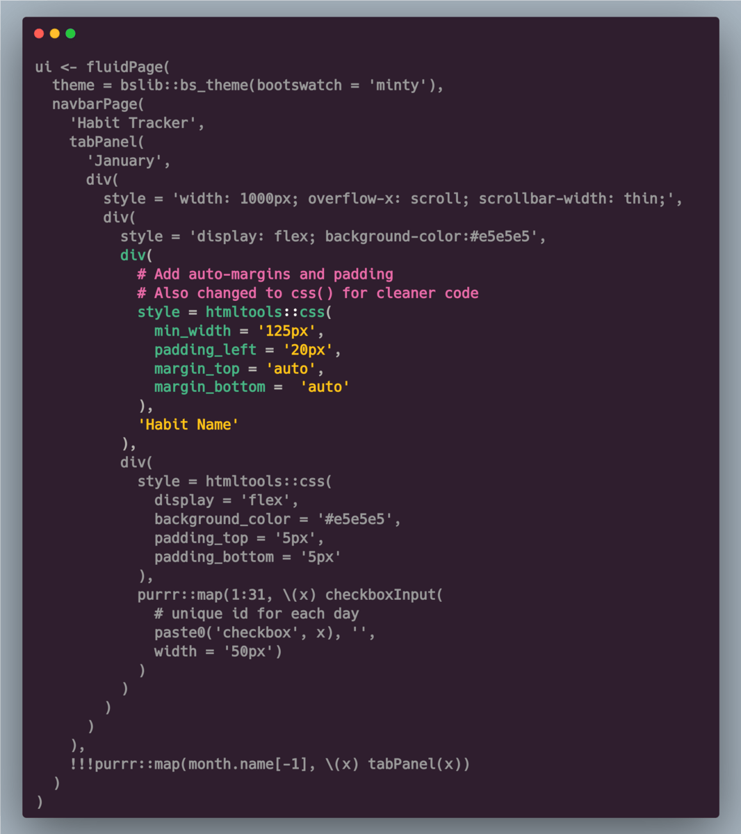
The box for the habit name became small because its div container is in a flexbox. These have automatic shrinking capabilities. To avoid the shrinking, you have to specify the min-width of the habit container (instead of width).

More stuff to center
Now we see that, in addition to the checkboxes not being properly aligned, neither are the texts. We can vertically center the texts by setting the top and bottom margins in the div that contains the text to auto.
This auto-option works only because the div we are changing is inside a flexbox. Also, I want the text to have a little bit of space from the left border of the div, so I'll add a padding too.
To be continued

Nice! Our text is centered now. We can basically apply the same trick of using auto-margins in flexboxes to center the checkboxes. We just have to figure out where to insert the correct CSS code.
Perfect time for a cliffhanger: Since I want to be respectful of your time and stay true to my 3-minute newsletter promise (which we’re already stretching today), let’s stop here and pick this up next week. The impatient folks among you can get the full code for the completed app here (explanations coming next week)
Hope you’ve enjoyed this week’s newsletter. If you want to reach out to me, just reply to this mail or find me on Twitter.
See you next week!
Albert 👋
Reply