- 3 Minutes Wednesdays
- Posts
- 3MW (Better heatmaps)
3MW (Better heatmaps)
Guten Tag!
Many greetings from Ulm, Germany. Like every week, let me announce the video that I published this week.
If you’ve been struggling to follow my explanations on how to color single words in any ggplot text, then my newest video got you covered. It walks you through the process step-by-step. As always, you can find it on YouTube.

Moving on. Let us talk about heat maps. Anyone can make a basic heatmap like this in seconds with ggplot.

But with a little bit of effort and a couple of tweaks you can improve this heat map. So, let me show you how to transform this heat map into something like this.

As always, the full code can be found on GitHub.
Simulate data
First, we need data to actually create a heat map. In this case, I do a quick simulation to generate fictitious data.

This type of data is inspired one of the most influential heat maps, namely the Measles heat map.

Create basic heat map
Now, we can create a simple heat map via this code. The main ingredient here is geom_tile().

This will give us a heat map like this.

Move title and color bar
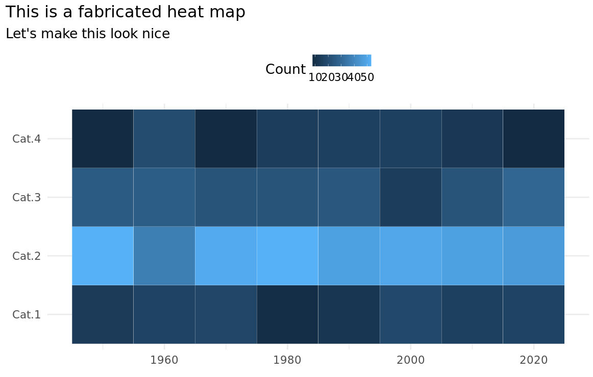
The first thing we may want to do is to move the plot title and the color bar. Both things can be achieved in theme().

But the resulting color bar is not very nice.

Adjust color bar (again)
Hence, let us move the to a better position via coordinates in legend.position. The moment you to that, you need to set legend.direction and make some room for the legend (e.g. by setting margins on plot.subtitle)

This change alone won’t do us much good. That’s why we also need to adjust the color bar itself. This can be done via the guides() function which can target the fill legend and set a new color bar with guide_colorbar().

Now this looks decent already (I really prefer a thin, long color bar)

Remove extra spacing
Now that the color bar is nice, let us remove the extra spacing around the axes labels. Here, this just means turning of axes expansion via coord_cartesian(). After you’ve done that, don’t forget to adjust your legend coordinates because they won’t fit anymore.


New colors
Now it is time to choose a nicer color palette. With heat maps you have to be careful a bit. I once forgot use a diverging (more on that soon) color palette on a correlation matrix and got roasted for it.
When you have count data like we have here where we just check the magnitude and there is no real “midpoint”, then you will want to opt for a sequential color palette. Most of the time, this means a palette that consists of one main color whose lightness is adjusted. Usually, you will want higher values to get assigned darker colors.
In ggplot, you can access such color palettes e.g. via scale_fill_distiller(). Here, I have chosen the ”Reds” color palette. In the docs, you will find more sequential palettes.

This will give us the following heat map.

When to choose diverging colors
In our setting, this does not really make sense. But if the value 30 were a sensible "middle point", then a diverging color could be used. Just change the type in scale_fill_distiller().


You could even fix the “midpoint” to 30 by using scale_fill_gradient2(). But then you have to set the hex codes of the colors manually,


Add text to cell
Finally, you can improve your heat map even further by adding text labels to each cell. This makes it a bit easier for the reader to figure out exact values.
The way to do that is to use geom_text(). By using its nudge_x and nudge_y arguments you can use move the labels to the bottom right corner of every cell. And also depending on the background color, you may want to change your text color.

And with that we have our finished heat map.

That’s it for today. Hope you’ve enjoyed this week’s newsletter. If you want to reach out to me, just reply to this mail or find me on Twitter.
See next week,
Albert 👋
If you like my content, you may also enjoy these:
Reply